Healthcare (NSW, Australia)
Piggotts Pharmacy – Website Redesign
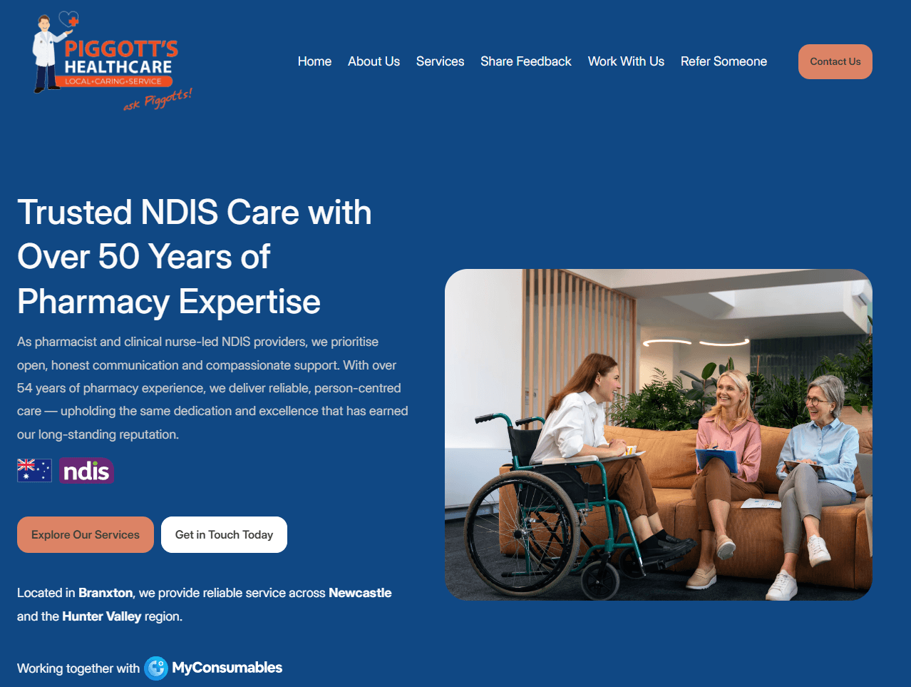
Piggotts Pharmacy is an established NDIS provider offering healthcare products and services across Australia. I led the redesign of their website to modernize the brand, improve usability, and highlight their NDIS support offerings for participants and carers.
Overview
Outdated Design: The previous site lacked modern styling and was difficult to navigate, especially on mobile.
Unclear NDIS Messaging: Information about NDIS services was buried or unclear for first-time visitors.
Disjointed User Journey: Pages were scattered, and users struggled to find what they needed—especially regarding product categories and service details.
Inconsistent Branding: Fonts, spacing, and components varied across the site, affecting professionalism and trust.
Redesigned the entire site with a clean, mobile-friendly layout and consistent branding
Restructured content to clearly communicate NDIS-related services, including a new NDIS Hub
Added clear calls-to-action, simplified navigation, and created more accessible forms
Developed reusable components to streamline future content updates
Improved SEO structure and speed performance
Research
Reviewed competitor NDIS provider websites to understand content gaps and opportunities
Audited Google Analytics to identify drop-off points and common navigation paths
Worked with internal stakeholders to understand how customers and support coordinators interact with the business
Tested wireframes with sample users for early feedback on navigation and clarity
Design
Modern & Accessible UI: Used high-contrast text, legible fonts, and clean spacing to enhance readability
Mobile-First: Optimized every screen for mobile users, who make up the majority of traffic
NDIS-Focused Content: Highlighted services and support options clearly for NDIS participants and support coordinators
Consistent Visual Language: Established a simple design system for buttons, sections, and icons to maintain brand cohesion
Results
🎯 1. 3x More Engagement on NDIS Pages
The updated structure and content led to a significant increase in time spent on NDIS-related pages.
📱 2. 70%+ Faster Load Times on Mobile
After optimization, mobile performance improved significantly, reducing bounce rates.
👍 3. Positive Feedback from Coordinators and Customers
Staff and customers reported that the site was much easier to use, especially when helping participants navigate NDIS claims.