Healthcare (NSW, Australia)
MyConsumables – Website Design & Build
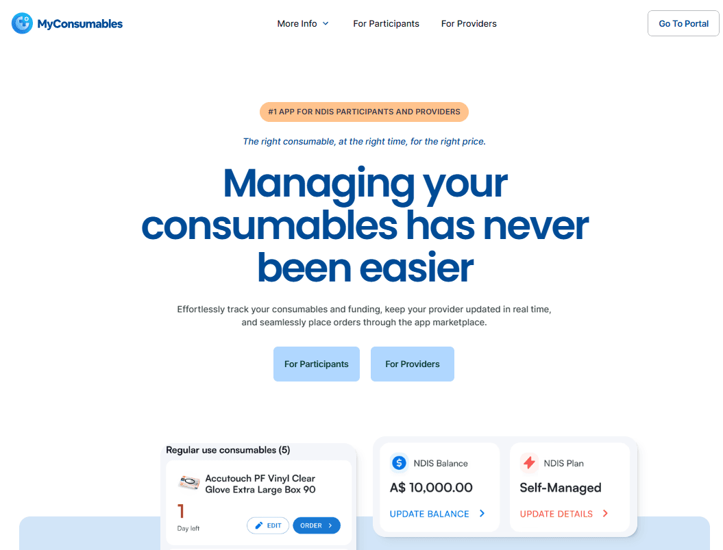
MyConsumables is a healthcare marketplace app built for NDIS participants and providers. I designed and developed the public-facing website to showcase the app, explain its benefits, and support onboarding for users and partners.
Overview
Explaining a New Concept: Needed to clearly communicate what MyConsumables is, how it works, and who it's for.
Diverse Audience: The site had to speak to NDIS participants, carers, and providers—all with different goals.
Trust Building: As a new platform, it was important to establish credibility quickly.
Lean Resources: Worked with a small team and limited content to launch a strong first version.
Created a clean, conversion-focused landing page with clear sections for each target user group
Wrote and designed simple messaging to explain how the app supports NDIS ordering
Highlighted app features, onboarding process, and benefits using scroll-friendly layouts and icons
Built the site with responsiveness and speed in mind, using modular components for future scaling
Integrated forms for provider signups and user feedback
Research
Interviewed app users and providers to understand their questions and concerns before signing up
Reviewed onboarding flows of similar platforms to find UX gaps
Audited accessibility and readability to ensure users of all tech skill levels could navigate the site
Iterated based on stakeholder feedback and early traffic data
Design
Friendly, Accessible UI: Used soft colors, rounded elements, and large text for a warm and inclusive look
Clear Information Architecture: Broke content into digestible sections (e.g. “How It Works,” “For Participants,” “For Providers”)
Mobile-First Approach: Prioritized a smooth mobile experience, knowing many users would be on phones or tablets
Consistent Branding: Extended the visual identity from the app to the website for a cohesive experience
Results
📊 1. 40% Increase in Signups After Launch
Website traffic converted well, with more users signing up for early access and provider onboarding.
📱 2. Avg. Mobile Session Duration Doubled
After optimizing the mobile layout and page structure, users spent more time exploring key sections.
🤝 3. Supported App Growth Through Visibility
The website helped position MyConsumables as a trustworthy, modern solution in the NDIS space—leading to more provider interest and user adoption.